UX DESIGN / FRONT-END DEVELOPMENT
Objective
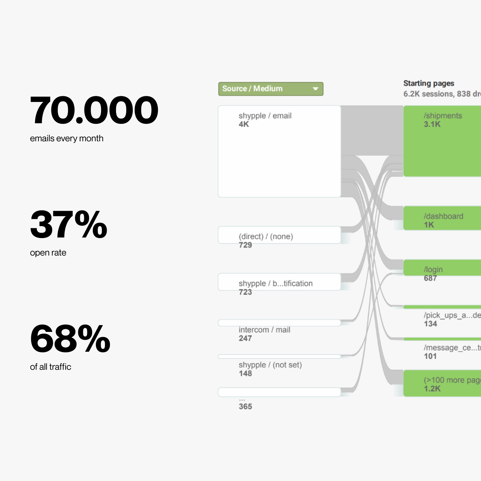
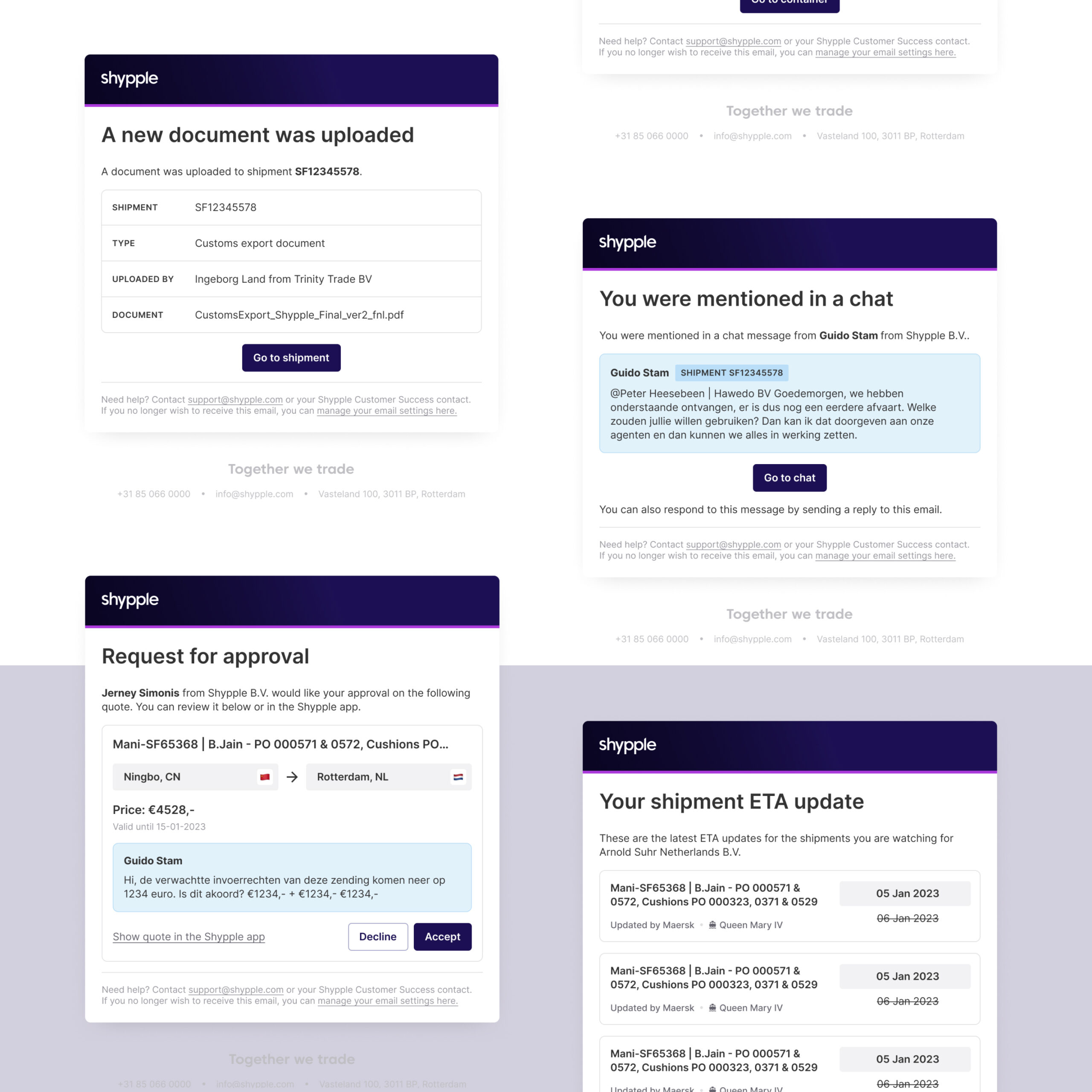
In the Shypple application, tens of thousands of emails are sent every month, playing a vital role in engaging users with the platform. These emails encompass various activities, from providing quotes to fostering communication about shipments and much more. Customers primarily use the Shypple application for a small portion of their day. The majority of their time is spent in other applications, on their phones, and predominantly in their inbox.
The objective of this project was to establish a uniform cross-platform experience, offering the flexibility to efficiently update existing emails and seamlessly incorporate new ones to continually improve user engagement.
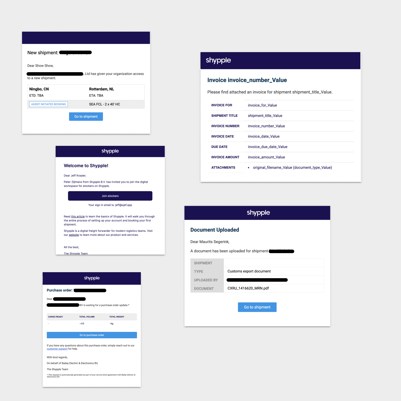
before
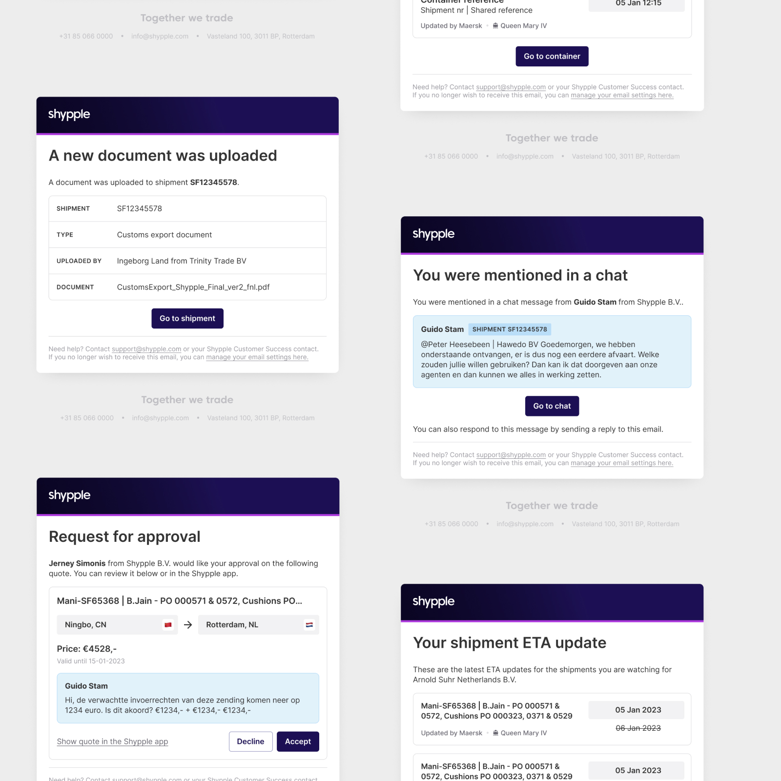
NEW
Approach
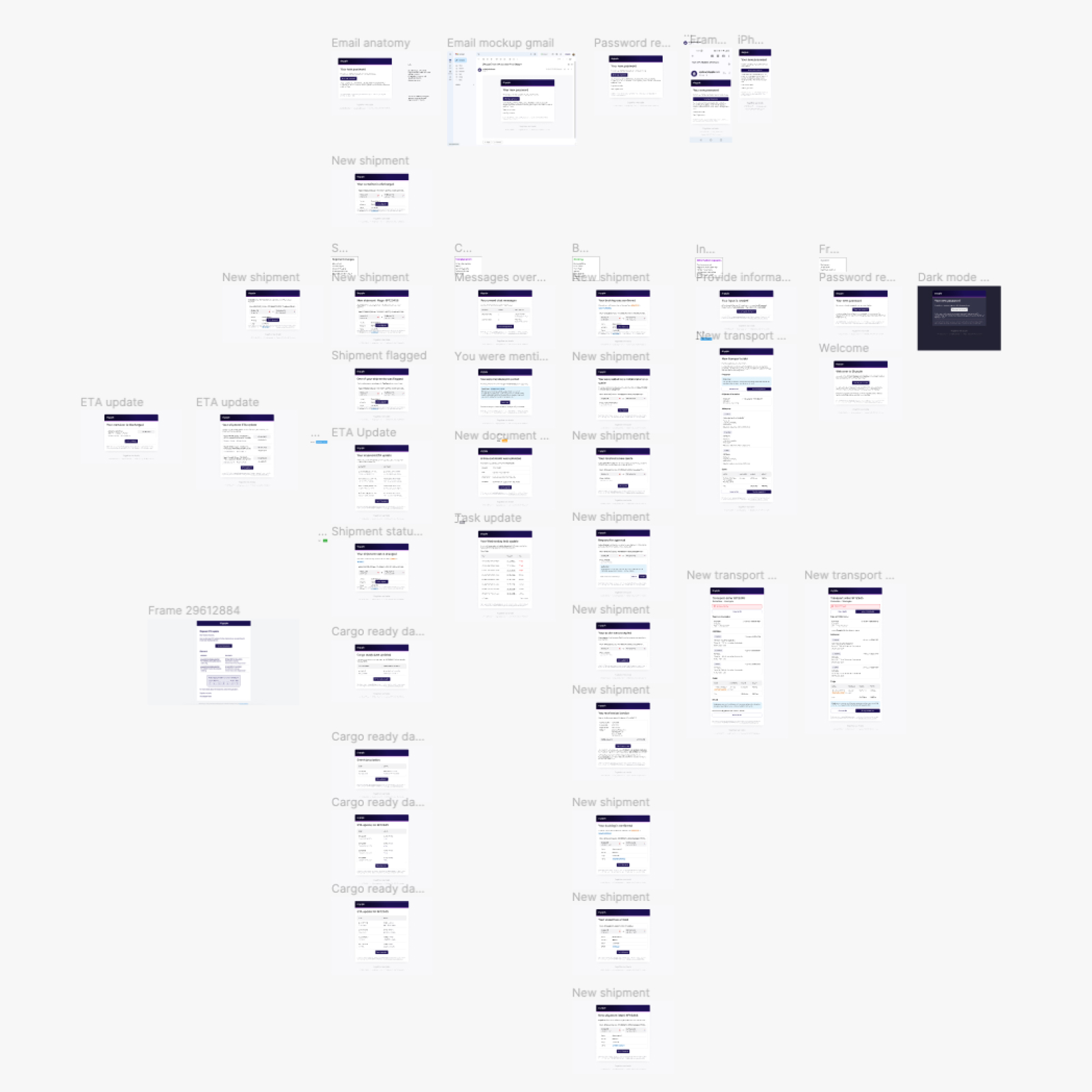
In this UX and front-end project, I began by researching how people use emails, demonstrating their vital role in user engagement. We also looked at what competitors were doing, learning from the best practices.
After this research, I explored various tools and frameworks to improve our email communication and presented the plan to our product management team, who approved our approach.
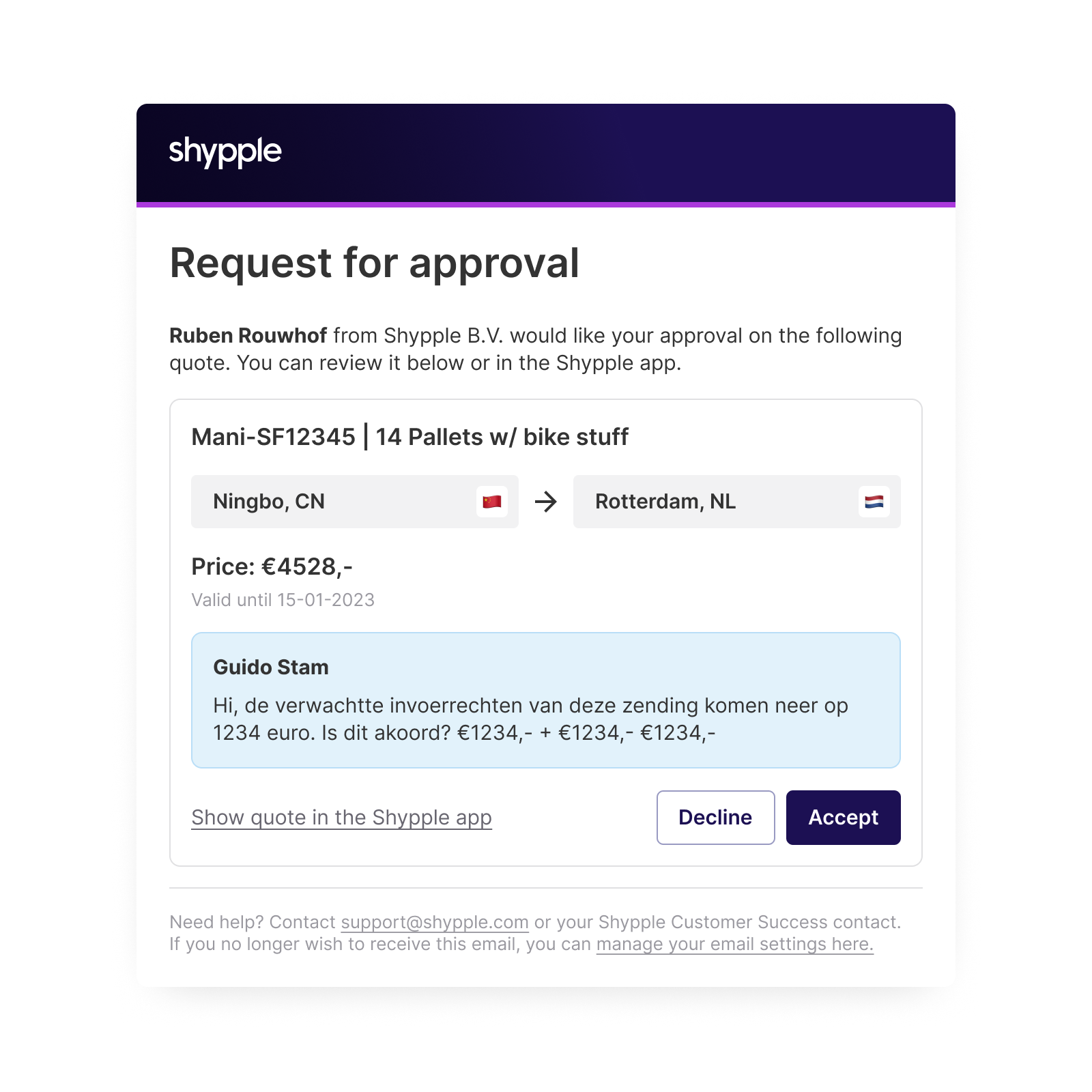
The design phase involved dissecting and redesigning our existing emails to match our application's design system while choosing a consistent tone for our emails.
Once the designs were approved and tested with end-users. I took on the role of developing the emails, ensuring they worked flawlessly using HTML, CSS, JavaScript, and Mustache templating.
Challenges
Consistent experience
The emails should be an extension of the application. Therefore, we created new design components that align with those in the application. Compared to the application, we simplified the components because email providers often have limited capabilities.
It's also crucial that the information in the emails matches that in the application. That's why we clearly communicate when the email was sent and provide strong links to the application for the most up-to-date information. This ensures a seamless transition between emails and the application, with consistent and easily accessible data.
Tools
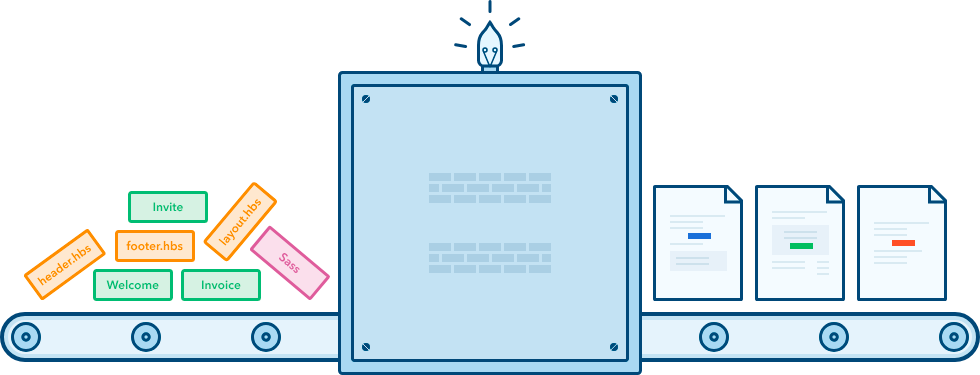
To meet our needs for flexibility, consistency, and effective collaboration with developers, we decided to implement a templating tool. This approach allowed me to create individual email templates using basic HTML and CSS locally.
It was crucial to employ reusable components and a centralized stylesheet to ensure consistency and adaptability. The final step was compiling our files into templates and deploying them to our email server for testing across various email clients
Selected Works
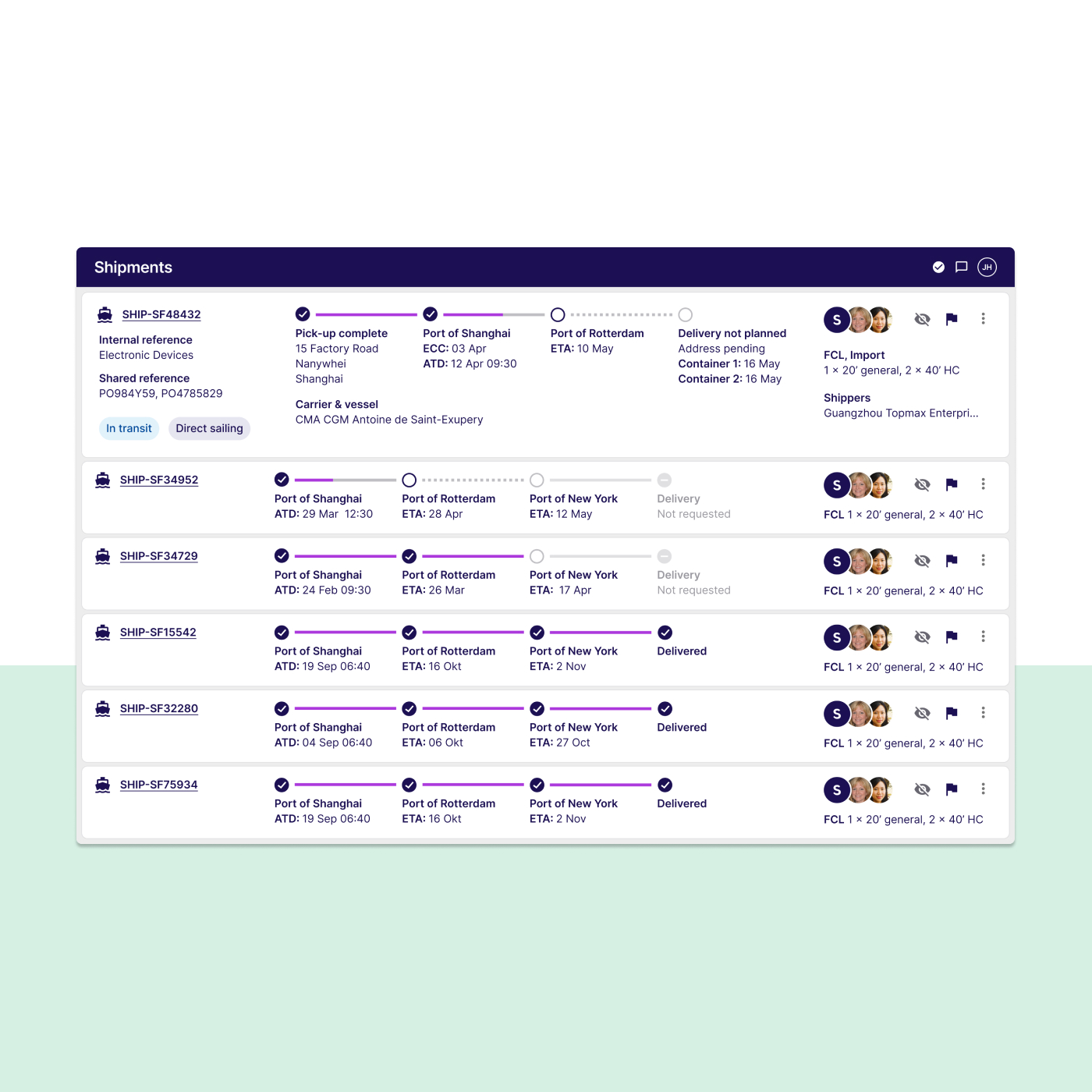
Designing the future of fresh freight forwardingUX Design & research
Transactional emailsUX Design & Front-end development
A.S AdventureUX Design
